Some folks are not afraid of color…and you shouldn’t be either!
I’ve picked out 5 gorgeous spaces with rich, energizing, and soothing colors which complement a lot of styles. Get inspired from these room and start your own color project to get ready for spring!!!
1. Valspar’s Dutch Licorice is one of those colors many designers absolutely love to work with. It looks like a blue-purple-gray-black-brown hybrid and it will add a wonderful bit of drama to a room.

2. Benjamine Moore’s South Beach 2043-50 is a really green turquoise which kind of looks like sea glass. It’s a light fresh color to give a ‘beach house’ feel to any home.
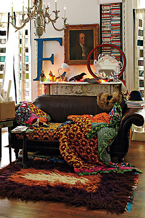
3. Valspar’s Carrot Cake is definitely warm but bold! Pairing it with less vibrant colors will help act as a grounding color. The plum colored rug has some black in it, which grays it out and turns it into a neutral backdrop for the intense orange!

4. White you ask? Why yes…white can be quite daring. If you have crown molding paint it high-gloss white to highlight the architectural detail. When you go white you have the freedom to use a LOT of color elsewhere.

5. Wallpaper is back in a big way! So I know this isn’t really a ‘paint color’ but there are so many styles from traditional and classic to bold and graphic to get creative. Wallpaper an entire room, an accent wall, or just part of wall. Lastly I picked a hand screenprinted (wall) paper sold at Anthropologie and I would love this for an office/work space area.